1. The New Experiment
In my last experiment, I looked at the results of offering a free eBook and how that affected my conversion rate for email signups. In that experiment, I kept the exact same Optin Form and only changed the copy – adding the eBook as an incentive.
This time, I did things a little bit different – I changed the old Optin with a new one, where I have more or less the same copy but less options (no more social sharing).
The result – a nice 115% increase in signups over the course of a 2 week period. That is less than the 625% bump I got after the last experiment, but then again I was getting almost no signups before that, so I wasn’t expecting anything of that magnitude.
2. The Before and After
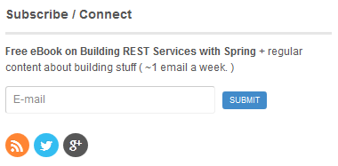
Here is how my Signup Form looked before the change:

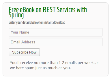
The new Optin form is simpler – the social sharing options are gone – and there is now only one thing you can do – Subscribe:

Notice that, besides some minor modifications, the main Call To Action copy is similar on both Optins. This is mainly so that I can clearly pinpoint any change in my signups to the new design and eliminate other possible influences as much as possible.
Next, notice that the new form is actually collecting more data than the old – I am now asking for the Name of my subscribers as well. It is a well known fact that the more information you ask for, the lower the conversion rate, because less people will actually bother to fill in everything.
But ultimately – the most important change is that the new form presents the reader with less options – the old form contains social buttons for Twitter and Google Plus, as well as a RSS feed link. The new form removes all of these so that the Call to Action is clear and there is no confusion about what I want the reader to do.
3. The Results
First, let’s look at the data from the previous experiment: I had 29 signups over the course of 28 days.
Now, let’s see how the new form changed things:

Over the course of 13 days, there were 28 new signups to my email list.
This represents a 115% increase in signups as a result of the current experiment.
4. Conclusion
This is another good step towards the end goal – which is a high performing email signup process.
My next experiment is going to be a proper A/B test – pitting several Email Optin forms against each other to see which one performs better.
Stay tuned (by signing up the my email list – go figure).