1. A New Experiment
I said in my last article that I’m no longer expecting an experiment to yield drastic improvements in my Email Signups. I was wrong.
My first experiment – offering a free eBook – resulted in a 625% increase, and my second – a completely new Signup Form – a more modest 125%.
So, my third experiment was simple – I fixed the position of my Email Signup Form (via plugin) when the reader is scrolling down. The idea is straightforward enough – with the form staying on the screen more, the reader will have more of a chance to actually read what it says and choose to sign up. You can of course check out the blog to see it in action.
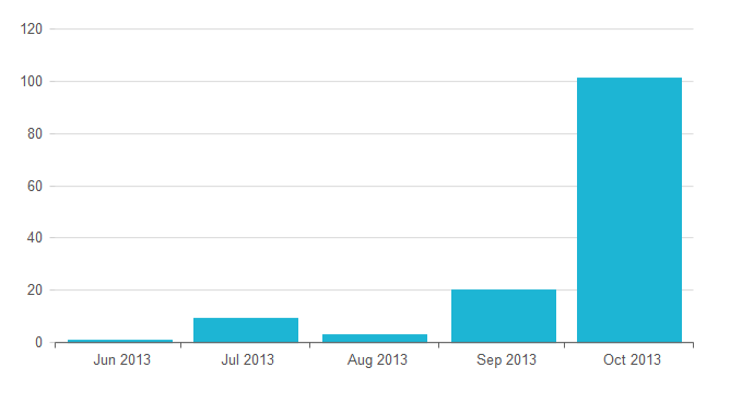
What I didn’t anticipate was just how much this small change was going to affect my conversion rate – nothing short of a 763% spike in signups.
2. Unexpected Results
The “Before” of this experiment is of course the “After” of my previous article:

Now, here is the data after I have made the change:

And finally, just for the visual impact this always has on my – here’s my Mailchimp:

3. Learning
The key takeaway from this experiment is that a single, uncluttered Call To Action works wonders, especially when the reader will keep eyeballs on it longer.
The “single CTA” point is – for me – also very relevant. Notice that my optin form does not contain any additional, secondary options – such as social buttons or badges. These would give the reader to many alternatives and less valuable ones.
Once a reader does go for one of these alternatives – for example they follow me on Google+ – it’s highly unlikely that they would also go back and signup for Email.
There are of course more “in your face” ways to collect emails – using a popup for example (on my TODO list) – but what’s interesting about these results is that this change does not qualify as “in your face” – just the opposite in fact.
Live and learn.
Still don’t see the “pop up” implemented on you website Eugen, you were postponing for too long. I implemented even better pop up – an “exit intent” one. It doubles my email conversions.
Visitors are very reluctant to click “no, I have too many customers”, so they are opting in my list.
Now I will try your “experiment #3” with fixed opt in form. Lets see if I have any change in subscription rate.
Hey Zhenya – yeah, I’m using the “Exit Intent” popup (from Leadpages) on the site as well now and seeing a ~2% conversion – which is decent. I haven’t tried the “make the user feel bad” route yet :), but it’s on my TODO list. Cheers,
Eugen.
no no, the “make the user feel bad” is not even an option.
Exit entent pop up – is just that, it appears only on the exit. So we not distracting our users, just inviting them right before they decided to close a tab with our web page.
I use wBounce – which is a free option to “Bounce Exchange” – these guys are notorious for charging $5000 for a WP plugin 🙂 but you can see a top of the notch implementation.
By “make the user feel bad” I just meant the “No, I don’t need more customers” message for the “Cancel”.
I didn’t know about them – their copy is fun, but I’m clearly not their target market 🙂
True (about the “cancel” button).
Me neither their potential customer 🙂